Kodak color blog
The Color Blog
Tackling Lightroom’s color mixer section— and why it is my favorite part of LR
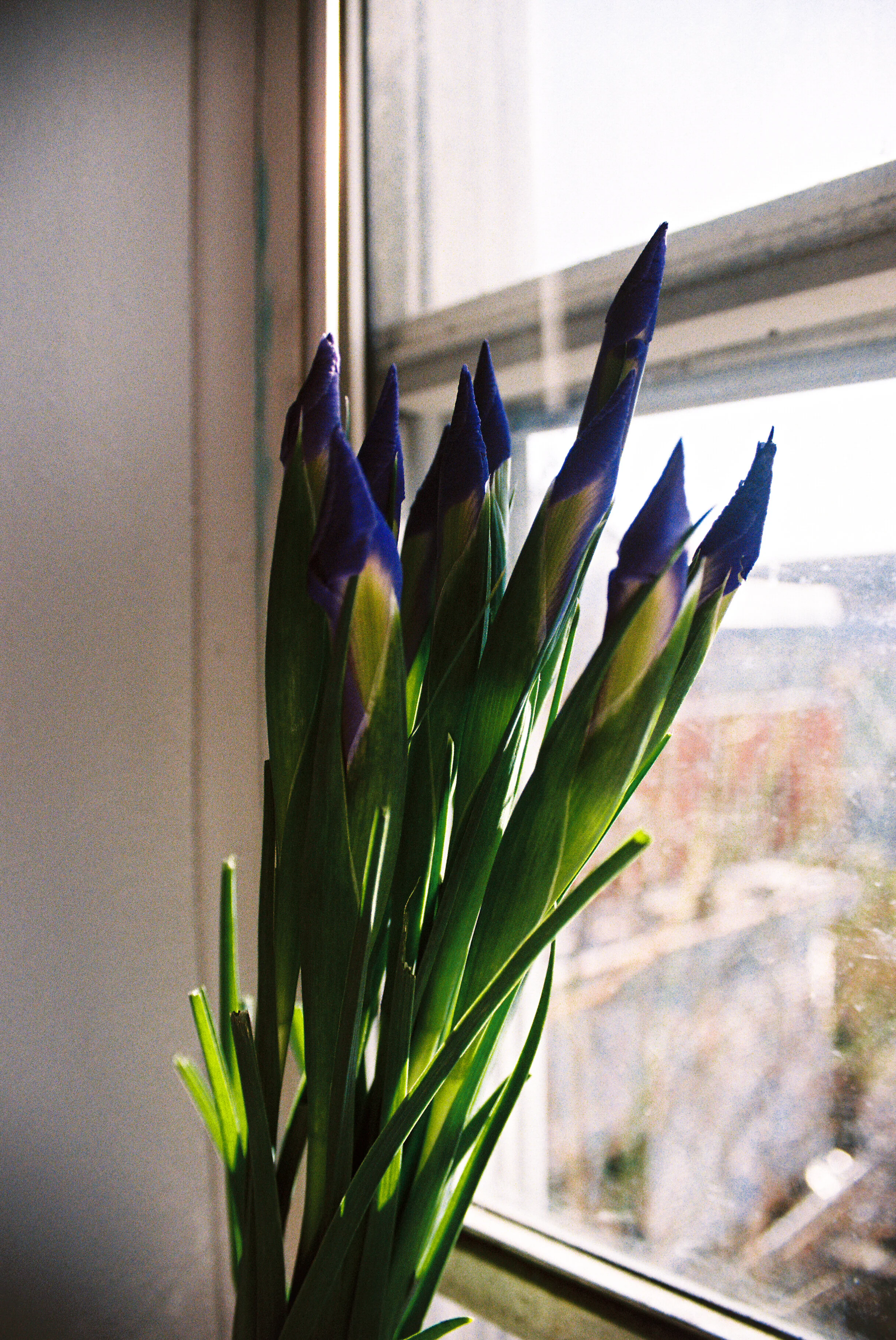
The color mixer section of Lightroom was a recent discovery and a huge part in advancing my own edits. Here you can adjust every color’s hue, saturation, and luminescence. These three things are capable of working together and creating stark color contrast and creating a sharp focal point for your audience. Dealing with underexposure leading to orange skin tones? Color mixer! Is the greenery in your portrait taking away from your model? Color mixer! The color mixer has been a great way to tackle everything from clothing to rosey cheeks. I have truly found that this section of Lightroom is responsible for creating more professional edits and overall clearer composed photos for myself. Below I give examples of previous edits and how I personally used the color mixer. These photos were taken with a Canon Rebel K2 and on Kodak 400 film.


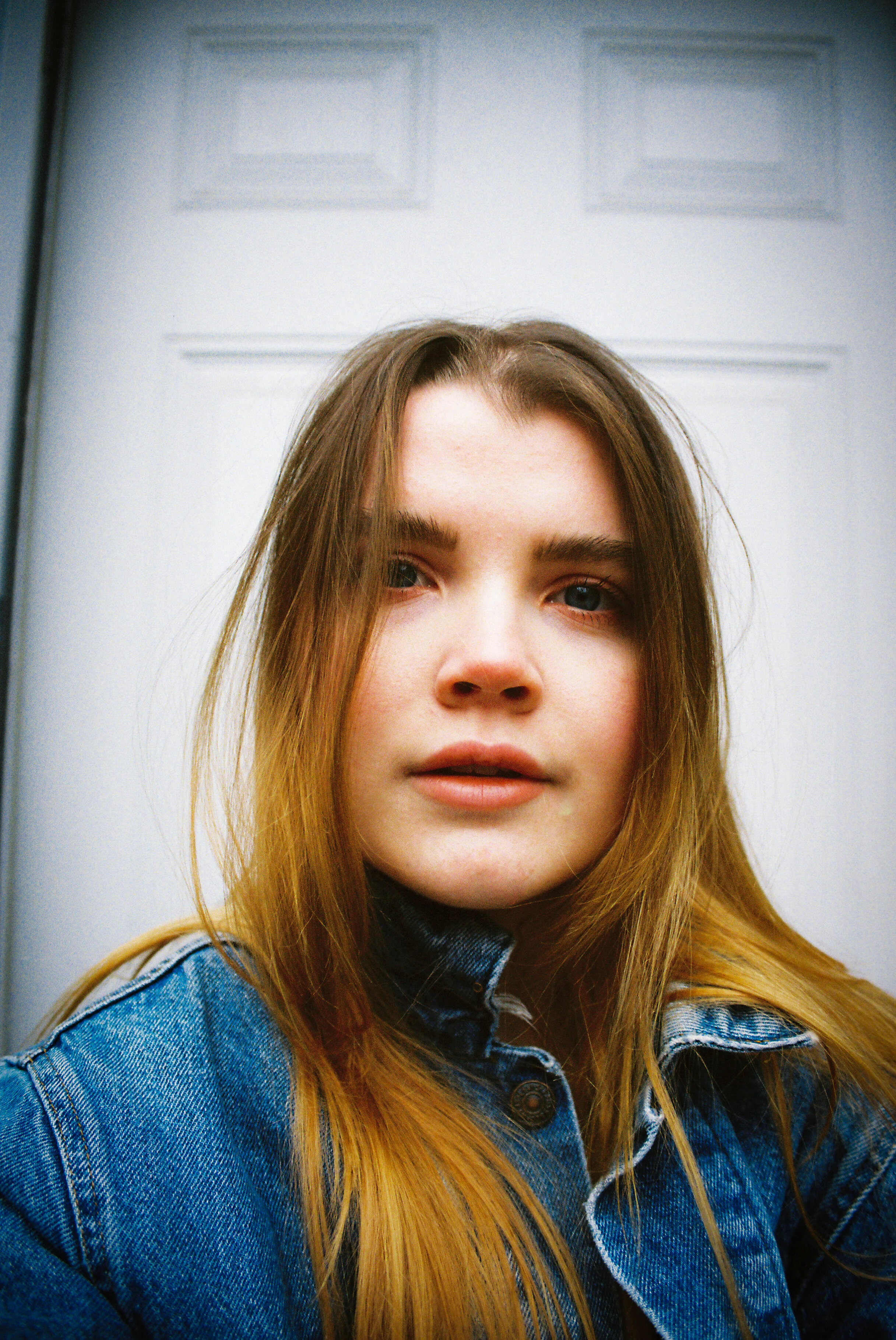
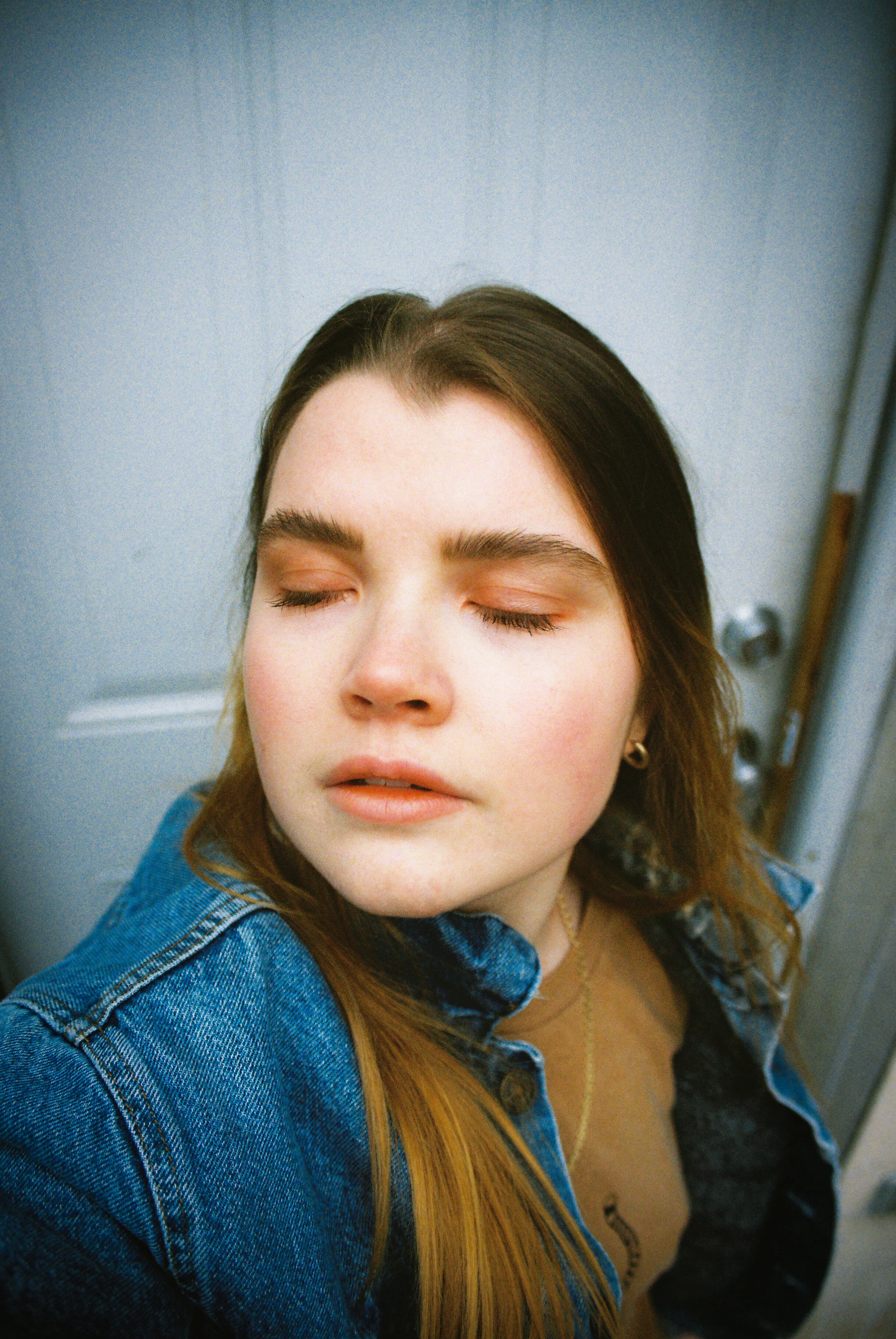
Color Mixer and Luminescence
Before (first photo) and After (second photo)
This edit was all about creating smoothness and enhancing the color contrast. I use the color mixer often in editing to bring forth skin tones and flatten/deepen background colors. For example, in this photo I increased the orange luminescence and decreased the blue luminescence found in your Lightroom color mixer. Bringing up the orange luminescence allowed for a smoother and brighter skin tone. It also diminished the focus on my acne although I handled that with the blemish tool later. Decreasing the luminescence on all of the blue really deepened the color of the denim, but also gave it a clearer texture in my opinion. The only negative towards deepening the blue is the whites of the photo are affected (as shown above). You’ll see that the white door in the image now has a slight blue hue. I didn’t mind this so much— but if I did I would just boost the whites in the light section of Lightroom.
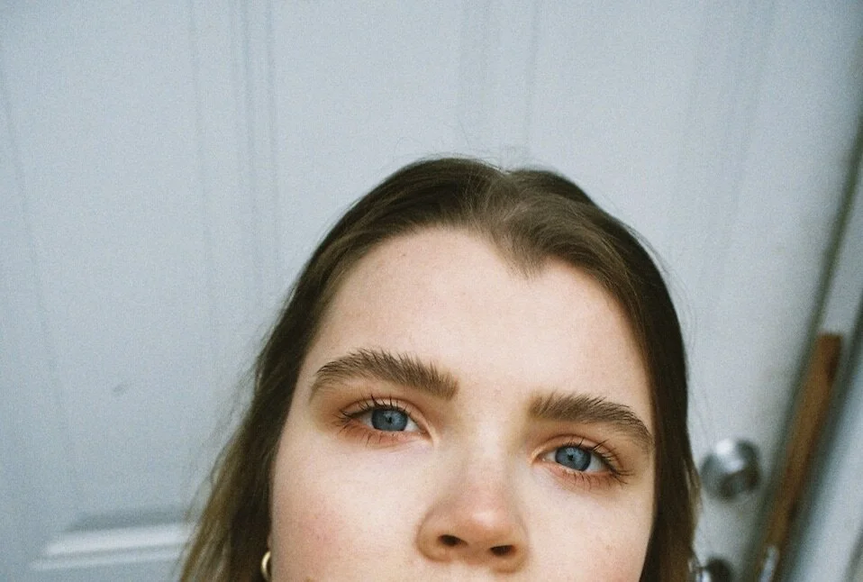


Color Mixer and Hue
Before (first two photos) and After (last two photos)
In the color mixer bar you’ll find a hue section for each color. This bar comes in handy when trying to create as much color contrast in the photos as possible. Creating a sharp color contrast allows for certain elements of the photo to really pop (in this case, I’ll focus on my eyes). Because blue and orange are near opposites on the color wheel, the two colors already allow for a clear color contrast but not as much as I would want since the eyes of this image are the focal point. The hue bar for each color allows us to deepen the contrast between the two colors even more. By dragging the hue bar for the blue to the left (towards the cyan side), and the orange to the right (towards the orange/green side) just slightly, you are capable of creating even more seperation between the colors and a clearer focal point. If I wanted to take it one step further (which I did) I clicked on red, and adjusted the hue bar slightly towards the orange side. Our skin tones often carry red underlying pigments. You can see these pigments on my cheeks and nose (and in full face images— lips). If you adjust the red to carry a more orange hue, you’ll likely create a sharper color contrast and be able to really draw attention towards the focal point (in this case: the eyes).


Color Mixer: Saturation
Before (first two images) and After (second two images)
I really had a tricky time with these photos— but I was striving for an end image that was less orange-y and overall brighter. The original photos came back super saturated— it was probably because I was shooting with a higher aperture— and I did not like that. So I opened up the color mixer and went to the orange tab and brought down the saturation, upped the luminescence, and slightly brought the hue to the purple side. This seemed to create a more natural and even skin tone. But because of this decision I don’t have nearly as much color contrast as the first photo— there is always a little sacrifice lol. I am very much torn between these edits and the original. I think because of the decrease in saturation for a color that is very present and prominent in the photos allowed for a bit more dullness than I would like. Bringing up the orange luminescence in this case also affected the scenery in the background (I also upped the exposure in the light settings which also affected this). The overall shade of the picture is determined by the lighting in the room. In this case I was shooting with just the sun— which is a bright shade of orange over the photo. Bringing up the luminescence and decreasing the saturation got rid of that all that natural orange shadow play but gave us a much clearer and even skin tone and focal point.
Ahhh bless the color mixer— If you learned anything or want to see more of this content feel free and drop me a comment or contact me through the contact page at the bottom of the site. Would love requests in Lightroom editing too if anyone is having a tricky time!